Line Charts
Line Charts in Buildaible allow you to visualize trends over time or sequential data. Whether you’re tracking project progress, task completion, or revenue growth, Line Charts make it easy to identify patterns and changes.
This guide will walk you through the steps to create and customize Line Charts.
-
Access the Reports Page
-
Open the app where you want to create the Line Chart.
-
In the Left Sidebar, under Views, click “Reports.”
-
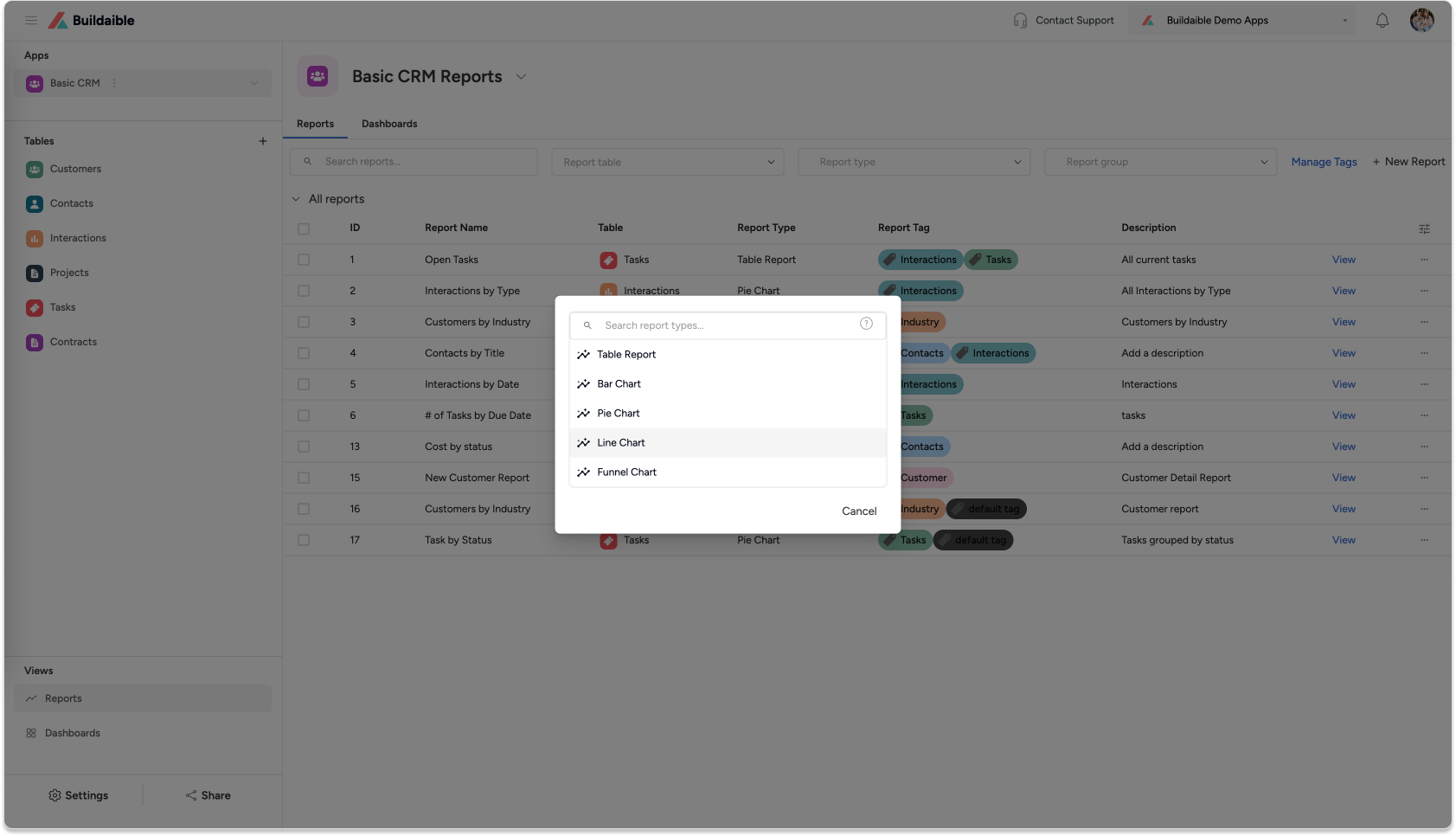
On the Reports page, click the “+ New Report” button.
-
From the report type pop-up, select “Line Chart” and click Next.
-
-
Configure Report Details
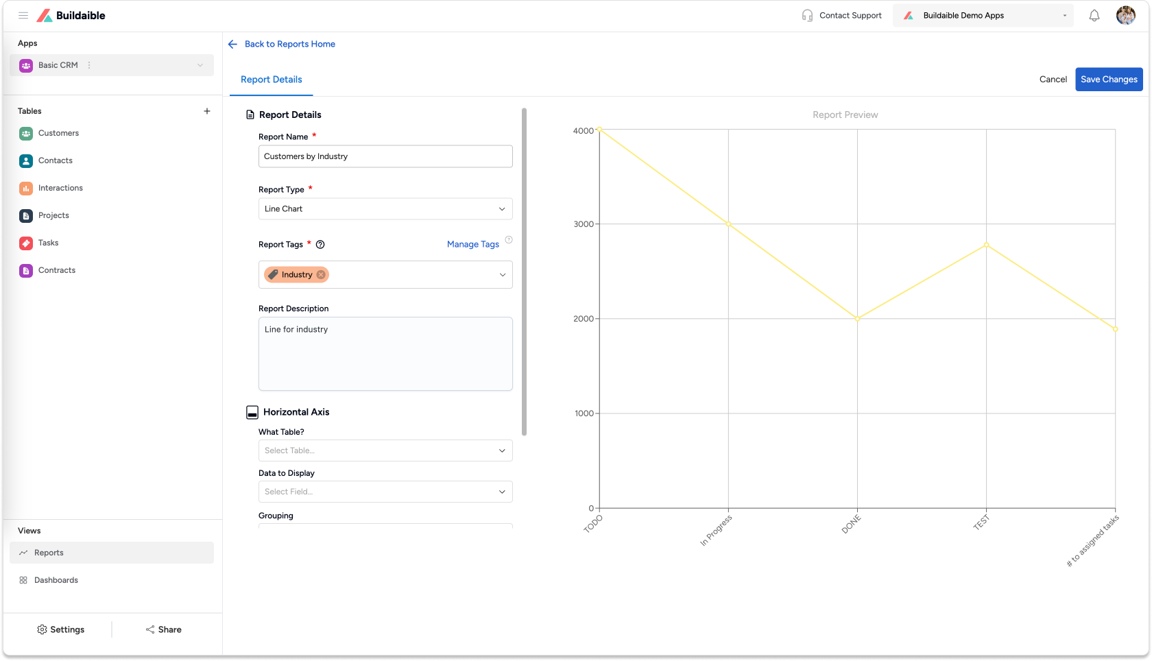
In the Line Chart Editor, begin by setting up the report basics:-
Report Name: Enter a name that clearly describes the purpose of the chart (e.g., “Tasks Over Time” or “Sales Trends”).
-
Report Description (optional): Provide context for the chart.
-
Report Tags (optional): Use tags to organize and filter reports.
-
-
Set Up the Horizontal Axis
The Horizontal Axis determines the values displayed on the X-axis.-
What Table?: Select the table that contains the data for the chart.
• Example: “Tasks,” “Projects,” or “Sales Data.” -
Data to Display: Select the field you want to use for the X-axis values (e.g., Status, Date Created, Project Phase).
-
Grouping: Group data by Equal Values or other relevant options.
-
Display Name (optional): Customize the name shown on the X-axis.
.png)
-
-
Add a Vertical Axis Series
The Vertical Axis defines the data points being plotted on the Y-axis.-
Under Vertical Axis Series, click “+ Add Series.”
-
In the Add Vertical Axis Series pop-up:
-
Series Name/Label: Enter a descriptive name for the series (e.g., “Task Count” or “Revenue”).
-
Data to Display: Select the field whose values will be measured.
-
Summarize By: Choose how to calculate the values—Count, Sum, or Average.
-
-
Colorize the Series: Click the dropper icon in the top-right corner of the pop-up to select a color for the series. This helps visually distinguish between multiple series on the chart.
-
Click “Add Series” to save the configuration.
Example Use Case:
• Plot the number of tasks over a Date Completed field.
• Plot sales revenue by month..png)
-
-
Save Your Line Chart
Once your chart is configured:-
Click “Save Changes” in the top-right corner.
-
The new Line Chart will appear in your Reports list.
.png)
-
Key Features of Line Charts in Buildaible
-
Dynamic X and Y Axes: Configure the Horizontal and Vertical Axes to suit your data needs.
-
Summarization: Choose to count, sum, or average the values on the Y-axis.
-
Real-Time Previews: Instantly preview the chart as you configure settings.
-
Multiple Series: Add multiple series to compare trends (e.g., “Task Count” vs. “Revenue”).
Next Steps
Now that your Bar Chart is ready, you can:
-
Add It to a Dashboard: Learn How to Create a Dashboard
-
Explore Other Report Types: Explore Report Types
-
Refine Your Data: Adjust the table, filters, or fields to further customize your report.
By using Line Charts in Buildaible, you can easily monitor trends and make data-driven decisions with confidence.