Pie Charts
Pie Charts in Buildaible allow you to visualize proportions and percentages in a clean and intuitive format. Use Pie Charts to see how categories compare against the whole—like task breakdowns, sales distribution, or resource allocation.
Follow this guide to create and configure Pie Charts in your Buildaible app.
-
Access the Reports Page
-
Open the app where you want to create the Pie Chart.
-
In the Left Sidebar, under Views, click “Reports.”
-
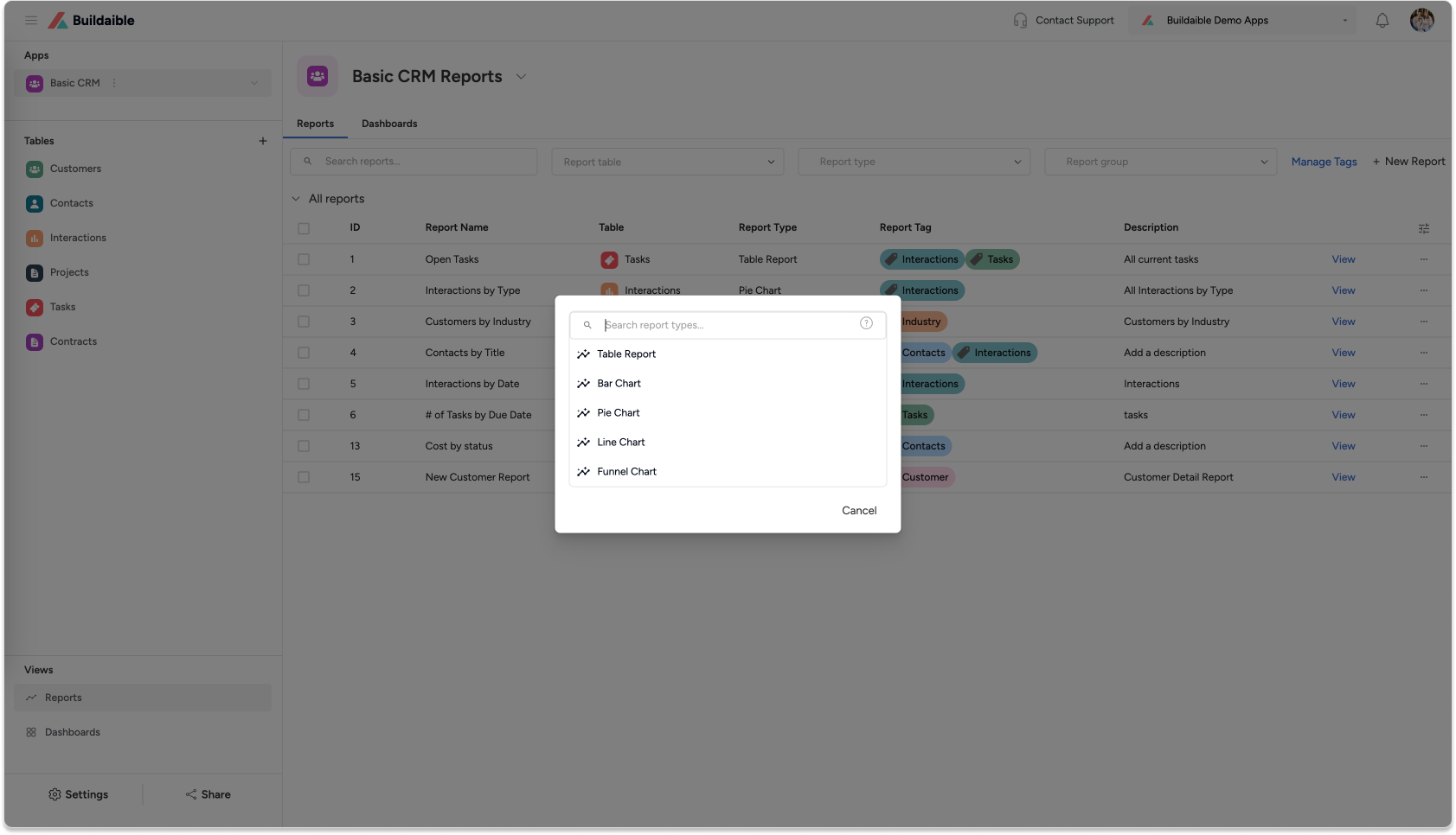
On the Reports page, click “+ New Report” in the top-left corner.
-
From the pop-up, select “Pie Chart” as the report type and click Next.
-
-
Configure Report Details
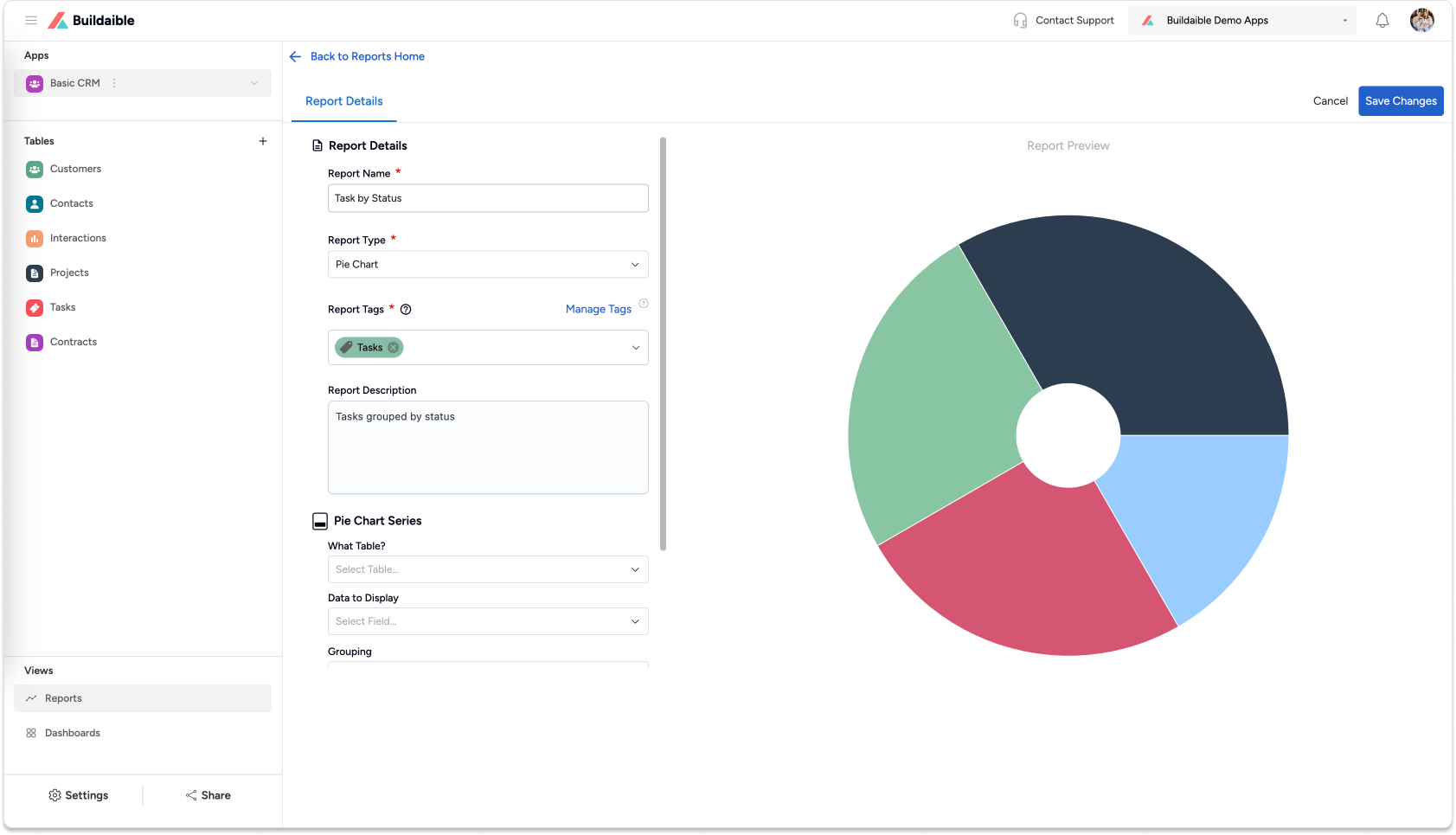
In the Pie Chart Editor, start by filling in the report details:-
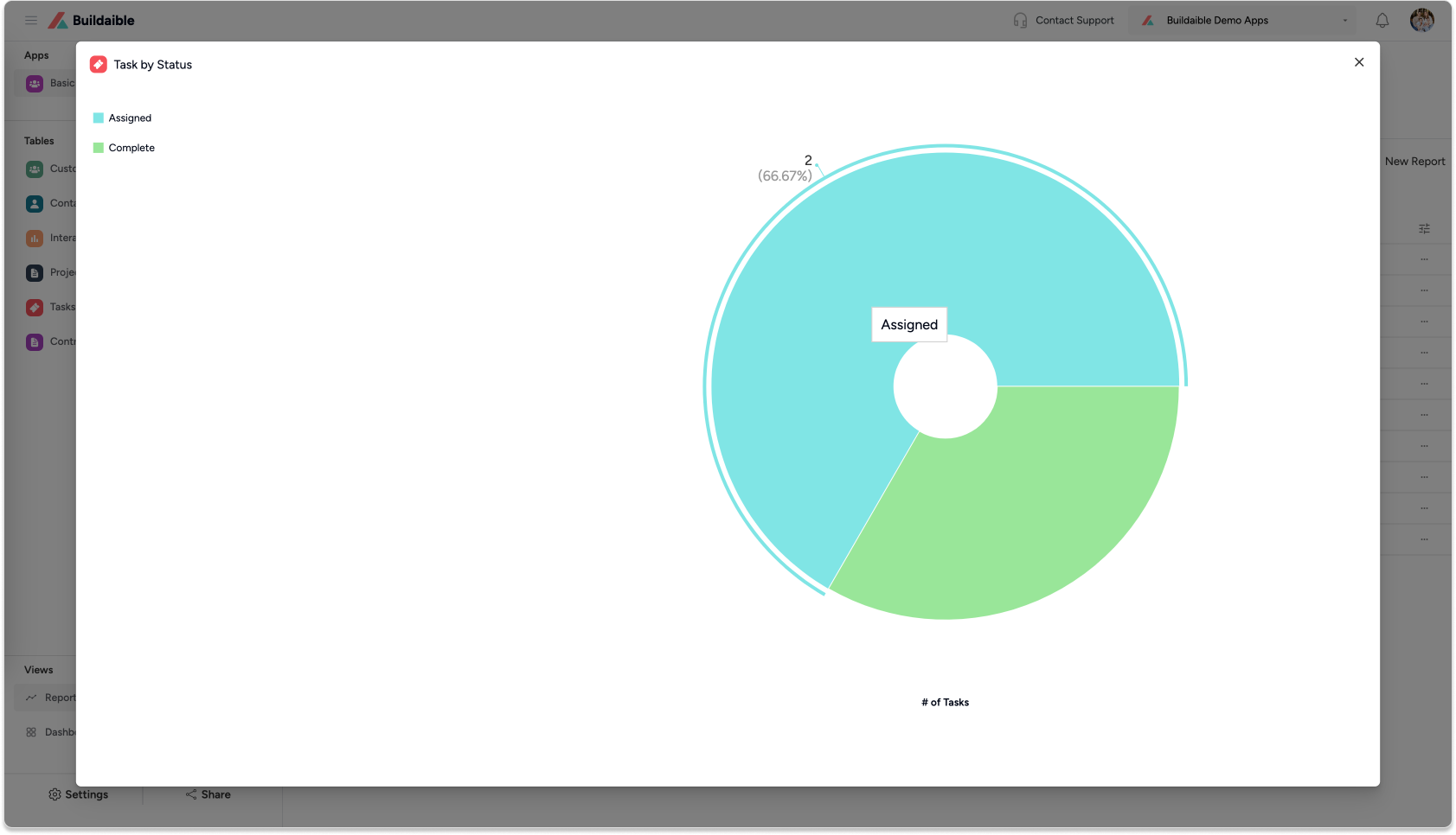
Report Name: Add a descriptive title for the chart (e.g., “Tasks by Status” or “Revenue by Region”).
-
Report Tags (optional): Use tags to organize and filter your reports.
-
Report Description (optional): Provide additional context about the report.
-
-
Configure Pie Chart Series
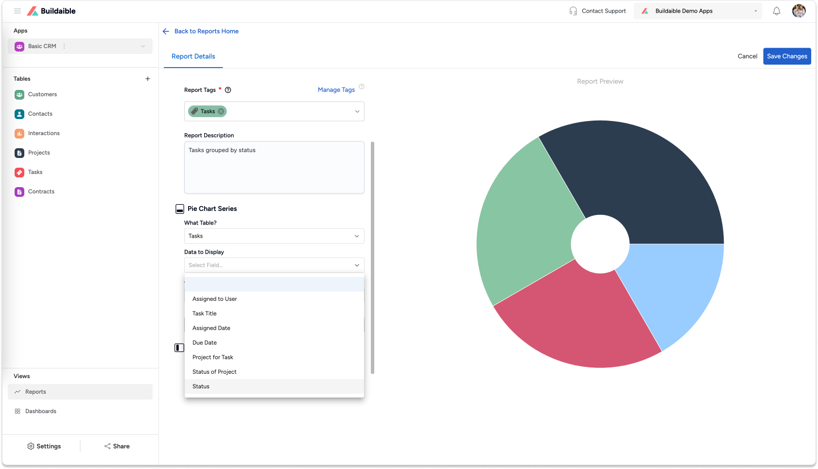
The Pie Chart Series settings define the data displayed in the pie chart.-
Select the Data Source
-
Under “What Table?”, select the table containing the data you want to visualize.
-
Example: “Tasks” for task statuses or “Sales” for revenue distribution.
-
-
Under “Data to Display”, choose the field that categorizes the data for the chart.
-
Example: Task Status (TODO, In Progress, Done) or Product Type.
-
-
Grouping: Use the default Equal Values grouping to group data by identical values.
-
Display Name (optional): Customize the display name for the series.
-
-
Add Pie Chart Data (Add Series)
To display summarized values in the pie chart:-
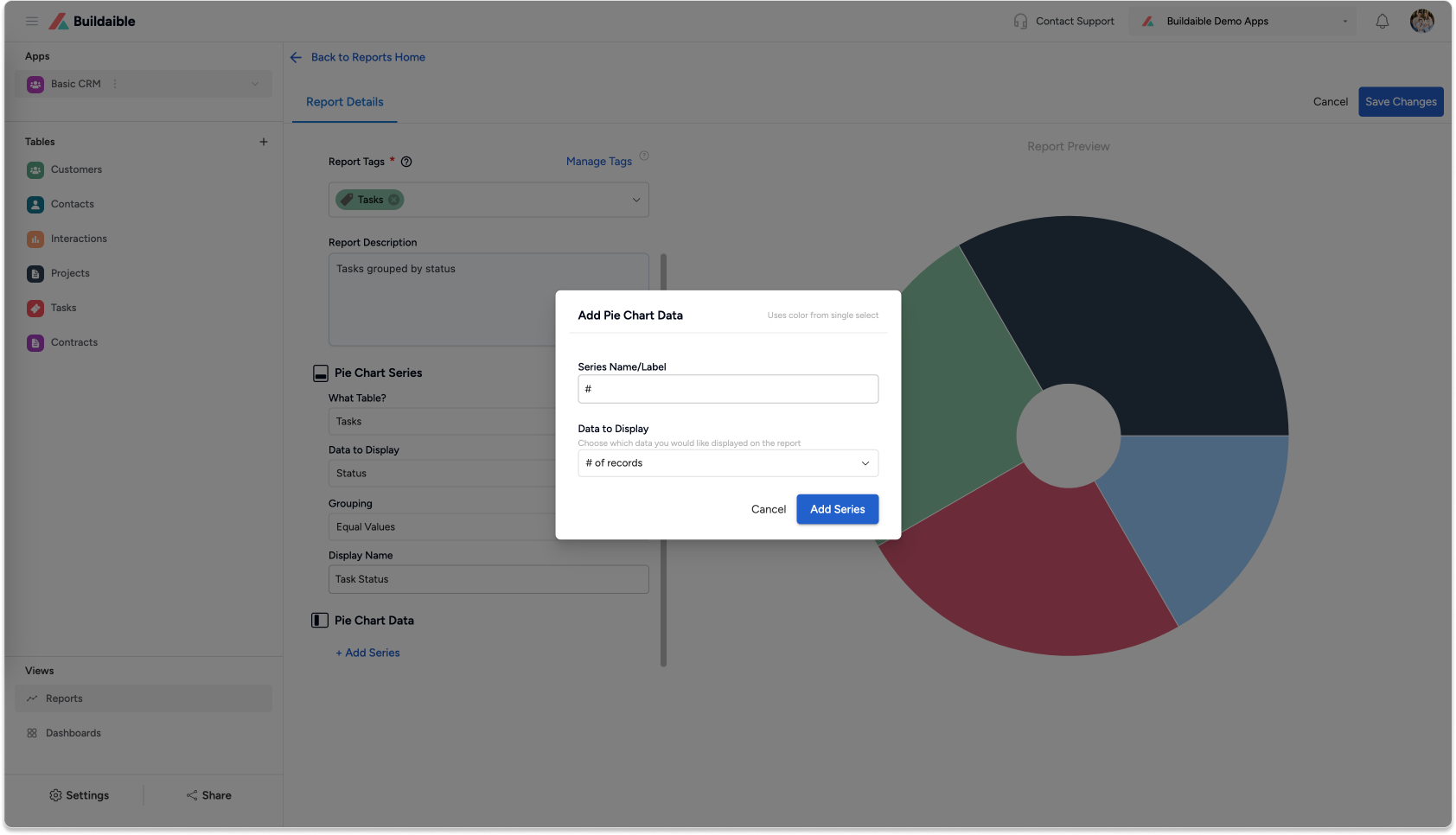
Under Pie Chart Data, click “+ Add Series.”
-
In the Add Pie Chart Data pop-up:
• Series Name/Label: Give the series a name (e.g., “Task Count” or “Total Revenue”).
• Data to Display: Select the field whose values will be represented in the chart.
• Summarize By: Choose how the values are calculated—Sum or Average. -
Click “Add Series” to save the series.
Example Use Case:
-
Group tasks by Status and display the number of tasks for each category.
-
Group sales by Region and show the sum of revenue for each.
-
-
-
Save Your Pie Chart
Once you’re satisfied with the configuration:-
Click “Save Changes” in the top-right corner.
-
Your Pie Chart will appear in the Reports list and can be added to dashboards or shared with your team.
-
Key Features of Pie Charts in Buildaible
-
Data Grouping: Group data by categories (e.g., Status, Region).\
-
Summarization: Choose COUNT, SUM, or AVERAGE to calculate values for each category.
-
Dynamic Previews: See real-time changes as you configure the chart.
-
Custom Labels: Override display names for clarity.
Next Steps
Now that your Bar Chart is ready, you can:
-
Add It to a Dashboard: Learn How to Create a Dashboard
-
Explore Other Report Types: Explore Report Types
-
Refine Your Data: Adjust the table, filters, or fields to further customize your report.
By creating Pie Charts in Buildaible, you can easily visualize proportions and make sense of complex data.